Do you like your website, but feel like it could look or perform better?
Maybe you are looking for a bit of a tune-up, because a full-blown UX Audit, complete with prototyping, testing, and costs sounds a bit daunting.
You are in luck. The Foremost Media design department has put together a short list of items that might be stunting your website's growth. Use this handy guide to identify potential roadblocks and correct them to bolster the user experience (UX) for your site's visitors.
What is the goal of a UX design audit?
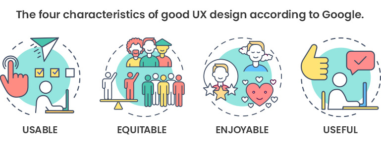
To evaluate the website/app based on the characteristics of good UX design according to Google — usable, equitable, enjoyable, and useful:
- usable — the design, structure, and purpose of the site/app are clear and easy to use
- equitable — the designs are helpful and marketable to people with diverse abilities and backgrounds
- enjoyable — the design delights the user and fosters a positive connection with them by addressing user thoughts and feelings
- useful — the design solves user problems
UX design audit checklist
1. Is the website navigation ensuring free movement? Is the path to the user’s goal clear? Here’s what we look for:
- The primary menu must give access to all important sections of the website. Every page must have breadcrumbs to mark a user’s navigation trail. Check breadcrumbs and footer links for contrast, size, brand color, and to make sure links work.
- If the user is scrolling down long pages of content and must scroll back to the top of the page again to get to the main navigation, then the website navigation should be stuck or fixed to the top of the page as the content scrolls underneath, or the navigation should go away as you scroll down the page and come back once you start scrolling up to the top.
2. Does your website have a search bar? If yes, is it quickly accessible and does it work?
3. Is the page structure easy to distinguish? Titles, headings (H1-H6), footers, and the content should help the user navigate the page. Effective use of different fonts and sizes helps make the site’s content layout distinctive and communicates the message effectively. Here’s what to check:
- Are there more than 2-3 fonts being used? At most, you usually don’t need more than three different font families in your site.
- We recommend that the paragraph font size should be no less than 16px and a line height (space between the lines of text) of 28px at a minimum.
- Use of upper case, title case and/or bold font weight for headings and subheadings.
- Are text links within the copy a different color, and do they hover to another color? Also, do they work and go where they are supposed to? Often, links are a blue color, which is a holdover from early days of the web when active links defaulted to blue. Today just about any color works to let users know that a text link is active. It doesn’t make a lot of difference if your text links are underlined or not, but they should change color when a user hovers over them with the mouse to let the user know the link is active.
- Make sure content density is not causing users to leave the page. Pages with large areas of text must be divided by headings, pictures/images (that must help the user understand the content), and white space.
- Layout leads the user to the Call To Action (CTA) links and buttons, which should be interactive elements, hovers, etc. Having a link or button hover to another color or some other animation gives the user the confidence that they are interacting with an active link.
- Is the site ADA compliant? Not sure? Here’s a Foremost Media podcast that will tell you what you need to know.
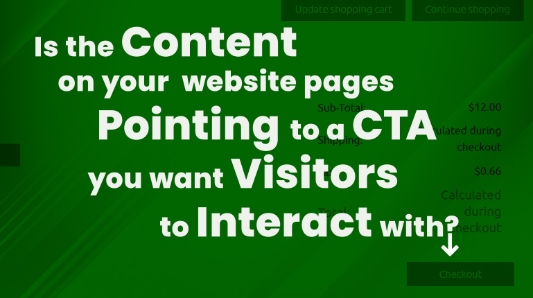
4. CTA buttons drive various goals. The CTA buttons must be distinct, appealing, and encourage action. Here’s what to look for:
- Are CTA buttons bold and using contrasting colors?
- Is there a micro-interaction to convey response on a customer’s action?
- Make sure your CTA buttons are visually prominent, stand out from the rest of your page, and look interactive.
- Are images or arrows being used to point to buttons? You tend to see this used more on landing pages. Landing pages (or lead-capturing pages) present a single offer and prompt the visitors to buy a product, register for a webinar, download an ebook, etc.
5. Content improvement also facilitates the main goal, execution: CTAs are being clicked/filled out/completed. Here's what to look for:
- Content adheres to the page goal: If it is a “contact" page, then content must stick to the ways the user can contact someone. Keep the page goal in mind when filling it with content.
- Content is logically structured and does not confuse users. Page uses Jakob Nielsen’s “Inverted Pyramid”: the most important info first, then proceed with supporting details, then moving down the list to the smaller and more nuanced details.
- No spelling or grammar mistakes.
- No extra content ... only that which drives a user to the CTA.
- Likewise, for design in general, you should pay attention to content structure and how it is divided: blocks of content, text bullets, white space, and illustrative pictures/images.
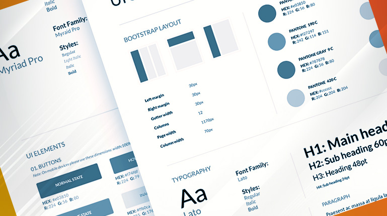
6. Web design aligns with the company’s brand, and the website design should be consistent. Here’s what to check:
- Are brand colors and elements being used and used properly?
- Logo, header, and footer on each page.
- Consistency in typography.
- Consistency in page layout.
- Check all visual elements of your design: images share the same style for the sake of a smooth transition between pages; all design elements (logo, favicons, headers, typography, colors used) don’t contradict each other.
- Site uses relevant visuals that add value, and uses good-quality, high-resolution images. Images should be optimized to minimize loading time, but the image quality should not be affected. You will also get better conversion if the photos original versus stock photographs.
7. The website renders well on all devices: Users can easily do what they came for on desktops, mobile phones, tablets, and so on. The design should be able to deliver a similar experience across all devices. Here’s what to look for:
- Review site design across all devices and review how page layout and elements react on different devices.
- Check for accidental clicks due to fat-fingering on mobile.
- Check for pop-ups on mobile.
Work toward optimization
If you find your site does not pass some of the items on this checklist, take the time to fix the issues and you will see these parameters changing:
- Bounce rate levels should decrease, because the navigation in the main nav and the navigation items within the pages are clear, users will understand what to do next.
- Session duration should grow.
- Users execute the main Call to Action: contact, purchase, share, etc.
Some of these items can take a little work, but for the most part a few tweaks here and there can help optimize your site's conversion rate.
Would you like an experienced designer to run your website through this checklist for you? Foremost Media’s design department offers a Basic UX and Design Audit of your website to see if it is performing as strong as it could be.
Get in touch with us to find out more.