Recently, we set out to find the best manufacturer websites on the internet to find out what makes them so great. We've been designing and building websites for manufacturing companies for over 20 years, so we think we have a keen eye for what's out there.
When all was said and done, we were able to collect 14 of them to share with you. And because we can't help ourselves, we also added some changes we would recommend. Some are nitpicky, but we believe even great websites have blind spots that could be improved.
We'll start with the why - but feel free to skip ahead to the list.
What Makes a Great Website Design for a Manufacturing Company?
If you’re looking to compete with some of these manufacturing titans of website design, chances are your current website is missing key capabilities. While your original site may have been serviceable when it first launched, it’s time to get serious about modernizing your website design to keep up with how people use the internet today. Check out this guide on tips for designing the perfect manufacturing website and getting more traffic, leads, and sales from your site.
The key ingredients to successful websites
By now, you might think that your company’s website design is only as good as it looks. While a beautiful design and User Interface (UI) are important, who doesn’t want their site to look professional and modern? Usability or User Experience (UX) is just as important. No matter how well your design looks, if it isn’t doing its job properly, then you might have some problems on your hands. Here are a few points to consider when building your website: Is navigation simple and clear? Is it easy to contact someone at your company? Does it load quickly? Does it have enough content to keep people interested in your brand? Is there a clear path and call to action for my users? Do the images and colors represent my brand? If not, then you may need to reevaluate some of these elements.
Manufacturing websites need to look great but they also need to show technical information and keep up with their strong brand values. The key is to strike a balance between a modern design and functionality; there’s no point in having an amazing-looking site if users don’t know where they should go or what they should do once they get there!
That said, don’t be afraid to spend time making your site look great. It’s one of those things that will make visitors more likely to stick around—and engage with your business. Most studies find it takes the average person about 10 seconds to decide to stay or leave after landing on your website. Your website is often one of the first things potential customers see when researching your company online, so it needs to make a strong impression.
The Key Benefits of User-Friendly UIs
The first thing to keep in mind when designing a website is that your visual design and UI elements are the link between your users and your information. Think images, buttons, navigation elements, calls to action, anything your user will interact with. Our job is to make things easier for them—not only by creating effective marketing strategies but also by creating websites and apps that are user-friendly and easy to navigate.
A good UI also needs to work well on all devices. A great UI has three key benefits: First, it makes sure that customers can find what they’re looking for on your site; second, it can help you engage with existing customers and convert new ones; third, good UIs can reduce errors (which translates into cost savings) and facilitate purchases. Something as simple as the shape of your buttons could leave your users confused and leaving your website.
Designing Better UX
Making sure your user has a pleasant experience and that your website user-friendly is one of your main concerns. When potential customers visit your site, you want them to feel comfortable. You also want to make sure they don’t feel like they have to commit hours before finding what they need. To that end, it’s essential that you avoid information overload—if a visitor feels confused or overwhelmed by your site, they are likely to leave without completing their goal and possibly avoid your company in future purchases or conversations. When designing UX for a manufacturing business, remember: simplicity is key!
Running a UX analysis on your company and current website will unlock some key knowledge about what is successful and what could use an upgrade. Researching user personas, competitors in the industry, and other aspects of your business all help us create a roadmap for your users to navigate your website. We can then create better prototypes and wireframes to test out what content works and what doesn’t before we get into the high-fidelity design work.
Here's the top list of manufacturing websites:
1. Tungco.com
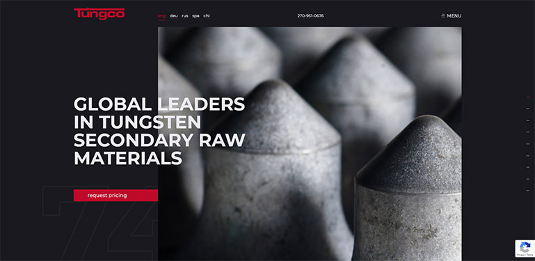
There’s a lot to love about this site. All of the pages are well designed and it’s clear that thought and creativity were placed into each piece of content. The animations are subtle but effective, being placed only where sensible and not too distracting. Branding has been taken into account every step of the way with the graphics and color scheme. Even the arrows are cut horizontally down the middle to emulate the logo. Calls to action are made very clear with “Request pricing” buttons on every page and the request forms themselves on every product page. To top it all off, there is a literal giant red arrow pointing to the primary call to action on the bottom of the homepage so you know exactly what the goal is for this site.
ImprovementsDue to the minimal and concise body copy on the homepage, too much is only available in the off-canvas menu. It might be better to guide the user through each process. whether it is learning more about the company, their services, or even applying for a position with them. Users notice this too if they know what they are there for and it might be a touch frustrating having to navigate to the menu too often.
2. Markforged.com
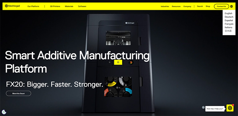
The design for this site is very strong, especially in the color scheme. The black product graphics on the black background makes for a stylish layout bringing your mind back to Apple website design. The lemon-lime yellow in the mega menu and the mega menu in the footer contrasts with the black as well making them practically impossible not to notice. In the design itself, you have large bold text titles and an amazing video hero image of the main product on the homepage. It’s very clear as well that each page was touched personally rather than just having content imported into a template and making it flow however it fits.
Improvements
The paragraph copy throughout the site is usually set to 14px which is a little small for comfortable reading by everyone. In some of the interior pages, the body copy is 18px which is much easier to read. They should standardize all the body copy throughout the site to be 18px.
3. Chromeindustries.com
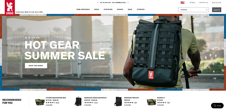
When a user lands on the homepage, immediately they get the impression that this is an eCommerce site from the look and feel of the page layout and easy-to-navigate top menu. Their products are both placed on white backgrounds and in big, bold, colorful photos of them in their intended environments. The former allows for visual simplicity and recognizability and the latter displays their intended targeted demographic, the product’s intended use, and not to mention style. This is true on the homepage as well as each of the product pages which is a nice touch. The cart page is also clean, organized, and easy to use.
Improvements
There is no way to contact the company by phone with email and chat being the only options for support. This can be very frustrating sometimes for a user whose question may be long and involved and they have to spend the time writing it all out in an email or chat. Not having a contact phone number on an eCommerce site may also foster distrust in a user. Speaking with a real person or even the possibility of doing so brings ease of mind in a world of automated scam chatbots, email bots, and websites. Another thing to note is that this company puts its privacy, terms, and promotion rules in the footer on every page. Search engines are probably putting more importance on these pages because of the link location than they should be.
4. Weima.com
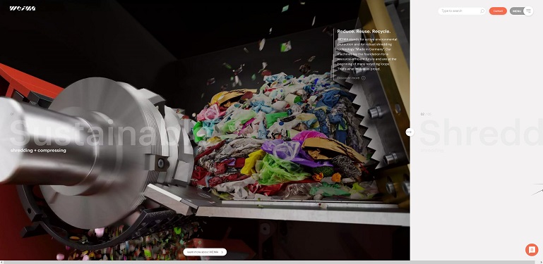
The images and animations on the homepage are topnotch, being clean, professional, attractive, and informative all at the same time. The body copy is succinct and to the point even on the product pages and the content is organized and sectioned out making everything easy to read. The interior pages, like the product pages, are templated but the content fits the template nicely instead of being forced in. The off-canvas menu opens fast and smoothly and is quite packed with useful content, queries, and navigation. It is also nice how the site has a mega menu in the footer so that you don’t always have to go to the off-canvas menu to navigate.
Improvements
Despite everything we’ve just said, the biggest opportunity here is still navigation. With no scrollbar on the right of the page telling the user that they can scroll down, the user may not know they can do so at first. The Carousel at the top of the homepage is frankly the primary source of this confusion because it is telling the user to start off scrolling horizontally. While there is an animated down arrow in the bottom left corner, it’s small and difficult to notice at first. It may also be confusing that the information when you scroll down is the same no matter which image at the top a user starts scrolling down the page under. Beyond that, the Search, Contact, and Menu buttons at the top of the site do not stand out well, especially if there is page content behind them and there are several links that don’t work.
5. Anduril.com
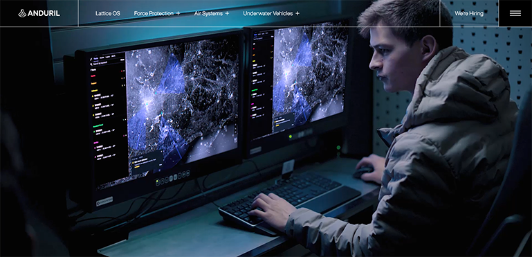
The name of the game with Anduril is military efficiency, efficacy, and consistency. The videos and graphics are so sharp and engaging, that you won’t want to take your eyes off them. The use of the font Helvetica and using it larger than you would normally see on a website gives the site a military defense feel. On all pages, the body copy is succinct and to the point. The testimonials are about the product on each product page allowing them to really get the most out of their testimonials and make them as relevant to the user as possible. The dropdown mega menu is a welcome addition even if there are only a few links under each category. The background dims when the mega menu drops as well bringing more focus to the menu.
Improvements
Attempting to navigate to their blog opens a new tab with a third-party website. And on the blog article pages, there is a sidebar on the right with unrelated articles or stories not belonging to Anduril. This could cause a user to start reading those blogs and get away from Anduril. Another opportunity of note is that the only way to contact the company from the website is an email link buried down in the footer. We’ve already discussed how this could potentially garner distrust in a user.
6. Marionbody.com
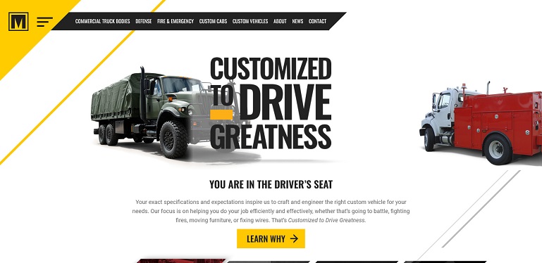
Branding all throughout this site is incredibly consistent and effective. Between the use of the Roboto and Oswald fonts and the color scheme of yellow, black, and grays, the whole site has a heavy manufacturing feel. On top of that, the use of diagonal lines in the graphics, buttons, and even the menu keep the entire site congruent with the logo. The top nav is across the top of the homepage. However, on interior pages, the top nav is just the hamburger menu. This works great on the product pages because with the off-canvas menu closed, the focus is then on the tabbed navigation that displays each product and product information on the same page when clicked. Some icing on the design cake is that the yellow button with the angled edge at the top of most pages just under the top banner image is dynamic, changing depending on what page you are on. For product pages, it is to “Find A Dealer”. On the info pages, it can be “Get Started” and this takes the user to the contact us page. On the contact us page, it’s “Get Marion News”.
Improvements
A newsletter subscription is a great marketing tool to get users to send their email addresses. In the newsletter section, just about the footer could be made to stand out more. Right now the newsletter area takes up so little space compared to the content around it. Could get glossed over by users moving through the site quickly. To that point, the design in the news and blog pages is a bit busy and with all the text the same color a user could gloss over articles they might be interested in.
7. Plex.com
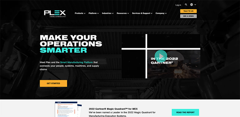
Plex doesn’t reinvent the wheel but their website is nothing to scoff at. With a very clean layout, great use of white space, and a minimal and succinct use of body copy, they uphold modern web design standards very well. Having a large and obvious call to action to contact the company just before the footer is often where you will see one on sites so users are getting used to seeing one there. On the interior page, this area turns into a call-out that asks you to choose your role and then takes you to a page of information that explains how the company’s products help someone in that role. As a side note, it is handy on the product pages that there is secondary navigation that scrolls a user down the page to the content.
Improvements
The “View full testimonial” buttons link to a third-party site. It’s never a great idea to take a user off of your site before they have tried to connect with you. Also, on the product pages when a user clicks the secondary navigation, it scrolls to the content clicked on. However, the secondary nav scrolls with the page so the user is unable to use it again. If you provide this feature, the secondary navigation should stop and fix under the top navigation so that for the long content pages the user can use it repeatedly.
8. Textechindustries.com
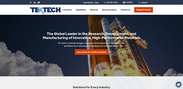
Textech tries some interesting ideas. The top banner image is dynamic, having the hero image change as the user hovers over the different categories. This is a nice alternative to a rotating banner since studies show that they are not watched by visitors all the way through. The hover animations on the buttons with the diagonal angles tie in the branding from the X in the logo. Although the interior pages are templated, they look good because the site’s content is not trying to do way too much for what the design and the content container allow. The most novel aspect of this site could very well be intentional or accidental. On the Contact Us and Request A Quote pages, the top navigation is no longer on the page. This could be a pro that by having no top navigation, there are no distractions to keep the user from filling out the form and submitting it.
Improvements
With the Contact Us and Request A Quote pages not having a top navigation, this could cause a user who is not very internet savvy to think the page is broken should they want to revisit something within the site. There may be a delay before they think of clicking on the logo to go to the homepage or the back button to the previous page.
9. Mecinc.com
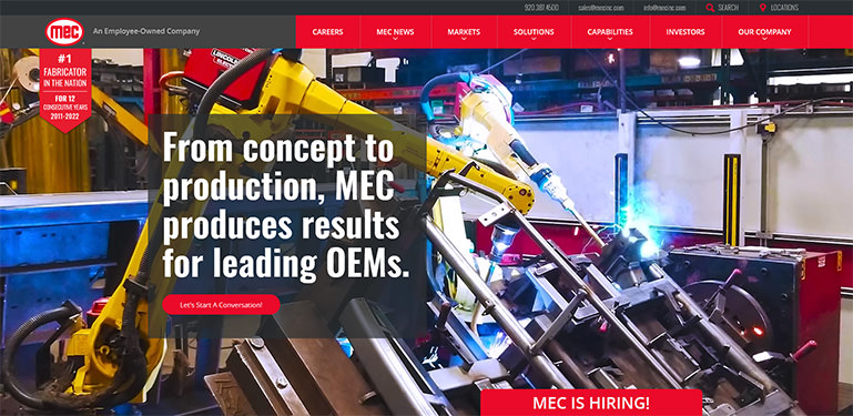
Manufacturing companies always seem like they are hiring, especially if they are expanding. MEC handles this drive very well in a number of ways. MEC tells you they are hiring with a tab at the bottom of the screen. It is large enough to draw the eye and encourages the user to scroll down for more information. When the user scrolls down, the “MEC is Hiring” is located alongside information about the company. Once a user has arrived on the career page, it’s made clear that this is an employee-owned company culture. Back on the homepage, instead of using a carousel that changes to another image and a different message to read (the type of carousel that research says very few if any users sit through) this site rotates big bold company images behind one message. Big bold images with minimal text are present all throughout the site in fact. They also have a section on the homepage where they have a callout that promotes cross-branding with their shooting sports company, MEC Outdoors.
Improvements
The main improvements needed on this site are on the Video Gallery page. The layout looks awkward and the user has to scroll down to view an unimpressive video module. The descriptive text overlaid on these videos is difficult to read at best and impossible to read at worst. The video gallery has a flash of white in between each slide rotation as well which looks unprofessional. Beyond that, the MEC News page needs more white space between the red “More” buttons and the next paragraph title. The same goes for the Press Release page.
10. Haydoncorp.com
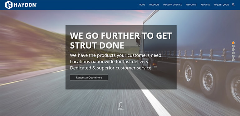
The Haydon Corp homepage is a fairly unique and interesting one. The homepage scrolls laterally one section at a time which puts a tremendous amount of focus on each section of content rather than a simple scrollbar. Each section has its own hover animations that differ from the other sections on the homepage. The mega menus under the “Products” and “Industry Expertise” tabs have a really nice use of illustrated products in the menu and nice hover transition animation between the categories. The use of product illustrations on the category pages themselves is also done really well. Within the product pages, there’s good use of tabs which is small but helpful.
Improvements
The homepage is really good until you get to the last section and the footer. The project form on the homepage is broken. There is too much padding under the title of the page and it is pushing the form down so the user can’t get to the submit button at the bottom. An amateurish graphic has been added just above the footer that brings down the overall aesthetics of the site.
11. Phantombio.com
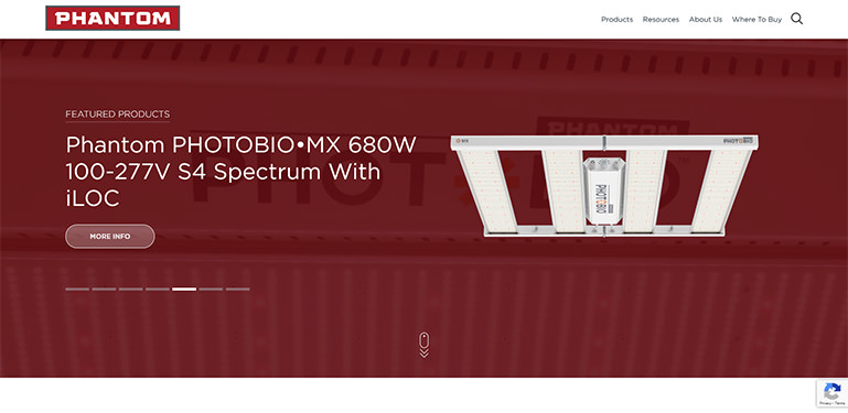
This website is pretty “lit” as the kids say (I’m sorry you had to read that). The homepage is very product-oriented with easy access to product pages in the banner. Frankly, the entire site is very well organized and easy to navigate. Let’s go back to those product pages though because this site has some of the best product pages on this list. All of the images are big and sharp with exceptionally well-sorted and displayed product information. A nice touch is the tab navigation as it scrolls the product pages and pins itself underneath the top navigation. All of this just makes the product pages very attractive from top to bottom. It doesn’t stop at the product pages though. A lot of the general interior pages such as the “about us” and the various “resources” pages are attractive in their own right.
Improvements
As attractive as the product pages are, an improvement could still be made on a few of them. Some of the product images in the Products Featured section have a white background and some have the background masked out. It would have been more attractive and interesting if the images were consistent with the white backgrounds being masked out. Otherwise and unrelated is a lack of H1 heading tags on any of the form pages.
12. Sescom.com
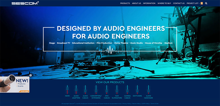
The homepage on this one might be one of the most unique and attractive on this list! The banner on the page takes up most of the page and scrolls horizontally with a soft rainbow color theme. The buttons one can use to scroll through the homepage are stylized to look like the sliders you might find on a soundboard keeping everything in theme with their product base. The animations for these buttons as well as on the banner are all very attractive and fluid. The mobile version of the homepage is almost as good as the desktop version with a rainbow gradient as you scroll down. The top navigation also uses the same images as the homepage banner keeping everything consistent. Alright, enough about the homepage. The category and product pages are clean and minimal with straight-to-the-point product information with no fluff.
Although not an eCommerce site, it works like one by providing a cart for your selected products that you can send to get a quote on. All of this with smooth and quick site functionality.
Improvements
As mentioned above, sending your users to a third-party site is a risky game that you should avoid playing if you can. Some of the pages are actually designed with this purpose in mind and in this case, it’s not a terrible idea but some of the links change the tab the user is on rather than opening a new tap and keeping the old tab intact which is definitely not a good idea. Also, the interior pages on the mobile version format all of the text in the center as opposed to being flush to the left like in the desktop version.
13. Badgercolor.com
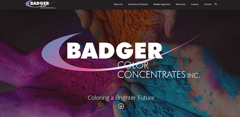
As you can probably tell by the name, this is a company that works in color and the website does a very good job at reflecting that. Right away on the homepage, there’s a strong use of vibrant colors against a dark background as well as vibrant colors all through the site. There is a colorful vector animation on the homepage which is very eye-catching and gives the user some insight into the process of making color for various products. The images on the site are a nice mix of photos shot at the company and stock photography with large gradient borders that help make the image more visually appealing. Finally, the top of each page has a menu that is easy to navigate and the bottom has a large “Contact Us” call to action leading to a site that was thoughtfully put together from literally top to bottom.
Improvements
The world is and has already been moving more toward mobile so you have to make sure that your website is not only mobile-friendly but optimized for it. As attractive as this website is, once you convert it to mobile it loses a lot of its visual appeal. The homepage animation doesn’t work correctly and most of the images are simply not there in the mobile version. Also, the animation on the homepage could use some pop-up elements to explain itself at each stage to the user more and there’s some inconsistent spacing between titles and text and images throughout the site.
14. Admmfg.com
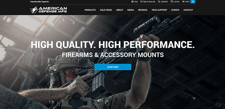
Our final entry is another eCommerce site that does pretty well for itself. Beautiful clean crisp images are used throughout the site. Not only product shots but images of people using the products. Quite a few videos are on the media page of the site that show the use of some of the products as well. The drop-down menu under “Products” is particularly nice with a product image appearing each time the user hovers over a product link. This helps give a user an idea of what to expect especially if a category is somewhat vague. Expectations also tie into calls to action of which there is one on every information block and section on the homepage. Navigation is also well done on this site with a simple and easy-to-use top menu and good use of tabs on the product pages. This is always good because it gives the user the ability to move through a lot of information without having to back and forth between the information. Lastly, the “Find A Dealer” page is a very nice feature of the site. Some users really want to be able to find a brick-and-mortar location so you can see the product before you buy, get better pricing, or ask questions.
Improvements
The content on the “Contact” page could be organized better. It has all the information needed by a user, granted, but it makes the user work for it by reading through a couple of paragraphs of text at the top of the page. To add to that issue, the contact form is at the bottom of the page when it should be an item you see when you first land on the page. Also, even though the page says that the company responds quickly to emails, the phone number can only be found in really small text towards the bottom of the page and nowhere else on the site. Making the phone number more prominent is the best practice for getting users to trust an eCommerce site. Even if all it’s there for is just to make the user feel better that it is there, it may improve conversion rates.
What makes an effective website design?
An effective website should be visually appealing, while simultaneously getting your company's message across and converting users into customers. A well-designed website can instill trust and drive them to your call to action. So how do we achieve such a website?
Simplify - Simplicity is the best way to ensure your user will have an easy-going pleasant experience on your website. Your branding colors and typography should be simple and easy to read, with not too many crazy fonts flashing images to distract the user. Any page that leads users to another page should have an obvious next button leading them along—don’t give them too much time to think about whether they really need something else from you. You’ll want to make sure your contact information is prominent enough that users can easily find it, but not so noticeable that they will feel compelled to contact you.
Consistency - Consistency in your design, branding, imagery, and calls to action will create a unified look and feel for your website. Doing so will make your users more comfortable and able to navigate through your website more freely without needing to think about where to go next or what to click on.
Clear Purpose - Your website should have a clear purpose and a clear call to action. Are your users supposed to contact you? Are they there to purchase products? Assemble a list and gather a quote? A clear purpose guiding them to your call to action or preferred method of contact will generate more sales and leads.
Visual Hierarchy - The way you arrange elements on a page in the order of importance can also help lead your customer where you want them to go. Using size, color, imagery, contrast, and white space among other design elements can call more attention to your content. This will help your user focus on the more important aspects of the layout.
Content - Using great eye-catching content will only help amplify your design. A great design accompanied by catchy copy and professional-looking, brand-specific imagery helps create consistency and trust in your users. Low-quality content will send your users running no matter how well the design is laid out.
Responsive Design - Your website also should be designed for your desktop monitor as well as your cell phone and everything in between. While we find with our manufacturing clients most of the traffic does come through on larger screen sizes, your website needs to be just as effective on all devices.
Want help bringing it all together?
Trust our team having a experts in the manufacturing industry. There aren't many who can compare to the talent and experience we bring. Contact our team to see how we can help.