AI is changing how people arrive at websites. Good design still has the same job: create clarity, establish trust, and make the next step feel natural.
AI has added new ways for people to discover a company, but it has not changed the fundamental job of a website. A site still needs to help someone quickly understand where they are, what the company does, and whether it feels worth exploring. That is a design responsibility before it is anything else.
From our perspective in the creative department, a high-converting website is not a collection of tactics layered onto a layout. It is the result of many design decisions working together: hierarchy that directs the eye, content that is shaped for scanning, imagery that feels credible, interactions that behave predictably, and a next step that is visible without being forced.
AI makes these decisions more visible because visitors may arrive with more context and less patience. They are not looking for a website to perform technology for them. They are looking for a clear, useful experience. The five essentials below are the design foundations that make that possible.
1. A Clear Message Visitors Can Understand in Seconds
The first screen has one primary job: orient the visitor. Before someone studies capabilities, company history, or technical details, the design should make the central idea unmistakable. What does this company do? Who is it for? Why should I keep reading?
That understanding is created through hierarchy. The headline, supporting statement, imagery, and primary action need to feel like parts of the same thought. The headline should carry the main point. Supporting copy should add context rather than restate it. The image should help explain the work, product, or environment instead of filling space.
Typography and spacing matter here as much as the words. A dominant headline, restrained line length, strong contrast, and enough open space give the message room to land. When every element is large, bold, animated, or brightly colored, nothing feels important. Good hierarchy is selective.
Specificity also strengthens the design. A statement such as “Precision components that keep critical production lines moving” gives the creative team something concrete to support with photography, diagrams, proof points, and page structure. A phrase like “Innovative solutions for a changing world” is visually difficult because it does not create a clear picture.
The goal is not to explain the entire company above the fold. It is to make the first idea strong enough that the visitor understands the page and wants to continue.
2. Content Shaped as Information Design
Content and design cannot be separated cleanly. The structure of a page determines whether information feels useful or overwhelming. A creative team should be involved in deciding what becomes a heading, what deserves visual emphasis, what can be grouped, and what should move to another page.
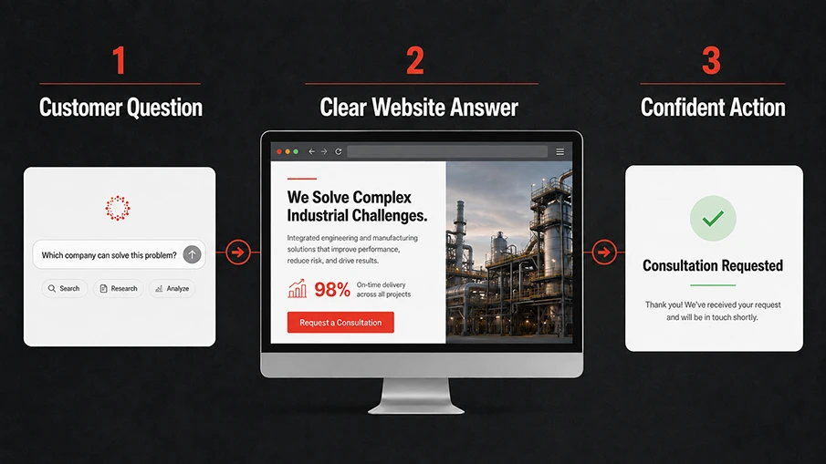
This becomes especially important as AI-powered search surfaces direct answers. Descriptive headings, concise summaries, useful captions, and a logical order help machines interpret a page, but they also make the experience better for people. A visitor should be able to scan the page and understand its shape before reading every sentence.
For service and capability pages, we look for a natural sequence: what it is, where it applies, how the work is approached, what details matter, and what proof supports the claim. Specifications may belong in a clean data treatment. A process may be easier to understand as a short sequence. Frequently asked questions should resolve real uncertainty, not repeat paragraphs that already exist above them.
This is where restraint becomes valuable. Dividers, cards, icons, tabs, and accordions are tools, not decoration. We use them when they clarify a relationship or reduce a long stretch of undifferentiated content. If every paragraph is placed in its own container, the page becomes a collection of fragments instead of a coherent story.
Well-shaped content gives people an immediate answer and enough depth to continue on their own terms. That is good information design, whether the visitor arrived from a search result, an AI response, or a direct link.
3. Responsive, Accessible Design That Feels Effortless
A design is not finished when the desktop composition looks polished. It is finished when the experience still makes sense on a phone, at different text sizes, with a keyboard, and under real loading conditions. Responsive design and accessibility are part of the creative system, not checks added after approval.
The hierarchy should survive every breakpoint. Headlines need to wrap intentionally. Images need crops that preserve the subject. Navigation should remain understandable without shrinking into a crowded row of labels. Buttons and form controls need enough size and contrast to be used comfortably.
Performance affects the creative experience too. Oversized images, unnecessary video, heavy animation, and decorative effects can make a page feel less considered when they delay the content or cause the layout to shift. Motion should show a relationship, confirm an action, or guide attention. If it does none of those things, it is probably adding noise.
Accessibility improves the design rather than limiting it. Clear contrast, readable type, descriptive link language, visible focus states, useful alternative text, and reduced-motion support make the site available to more people. They also create a calmer, more disciplined interface.
When these details are handled well, the site feels effortless. The visitor does not notice the breakpoint logic or interaction rules. They simply experience a page that behaves the way they expected it to.
4. Trust Made Visible Through Art Direction
AI can generate polished language and convincing imagery in seconds. That makes generic presentation easier to produce and easier to recognize. Trust now depends on details that feel specific to the actual company, its people, and its work.
For the creative department, this starts with image selection. Real environments, products, processes, and team members carry more meaning than a generic handshake or an abstract technology graphic. The photography does not need to feel overly staged. It needs a clear subject, intentional composition, and enough context to show what is real.
Proof should also be designed into the page rather than collected in one strip near the bottom. A case-study result can sit next to the claim it supports. A certification can appear where quality is discussed. A short expert profile can give technical content an identifiable author. These choices connect the evidence to the moment someone needs it.
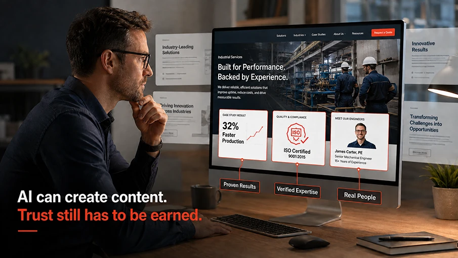
Specific details give the design weight. “We improved production efficiency” leaves the visual team with very little to show. “We helped reduce changeover time by 32%” can become a clear result, paired with the relevant process, facility, or team. The information feels more grounded because the visual and verbal evidence point to the same story.
Consistency completes the effect. Type, spacing, color, iconography, photography, and interaction behavior should feel like one system. When the site changes personality from section to section, credibility weakens. A coherent visual language signals care, authorship, and attention to detail.
5. A Next Step Built Into the Composition
A call to action should not feel pasted onto the page after the design is complete. It should be part of the composition from the beginning. Its position, contrast, size, wording, and surrounding space tell the visitor whether it is the primary next step or simply another link.
The strongest action is specific. “Request a Quote,” “Schedule a Consultation,” or “Talk With an Engineer” explains more than “Submit” or “Learn More.” The visual treatment should support that clarity without turning every button into the loudest object on the page.
Secondary actions still have a role. Someone may need to view a project, compare capabilities, or read a technical guide before making contact. Those options should be visible but quieter. When five buttons use the same color and weight, the design has transferred the work of prioritizing back to the visitor.
Placement should follow the story of the page. After a useful explanation, relevant result, or project example, the next step feels earned. The visitor should not need to scroll back to the hero or search the navigation to continue.
The experience after the click matters as well. Forms should feel proportionate to the request, error states should be clear, and confirmation messaging should explain what happens next. The final interaction is part of the design, not an administrative screen outside it.
AI Raises the Standard for Intentional Design
The age of AI does not require every website to look more futuristic. It requires the design to be more intentional. Clear hierarchy helps people and machines understand the page. Thoughtful content structure makes expertise easier to find. Responsive and accessible behavior makes the experience usable. Specific art direction makes the company feel real. A clear next step gives the page a purpose.
These are not separate layers. They are one connected design system. A beautiful hero cannot rescue unclear content. Strong writing cannot compensate for an unstable mobile layout. Real proof loses impact when it is buried inside a generic template. Every part needs to support the same idea.
The websites that stand out will be the ones that feel considered. They will help people orient themselves, find useful answers, recognize real expertise, and move forward without friction. That is what good website design has always done. AI simply makes the difference easier to see.
Is Your Website Designed for How People Discover and Decide Today?
Foremost Media’s creative department helps manufacturers and B2B organizations turn complex information into clear, credible website experiences. We bring structure, visual hierarchy, content, imagery, and interaction together so the site feels like one intentional system.
Request a Website Consultation