Form/input field button design is crucial as it directly impacts the overall user experience (UX) and the success of the digital product or application. Implementing UX button best practices helps ensure clarity and functionality while providing visual cues that guide users through the interaction process.
When users want to complete a task on a website, such as logging in, registering, or searching for a product, they’re prompted for information. A form input, or form field, is the interactive element used to capture this information, and clicking on a button is a common way to perform this task.
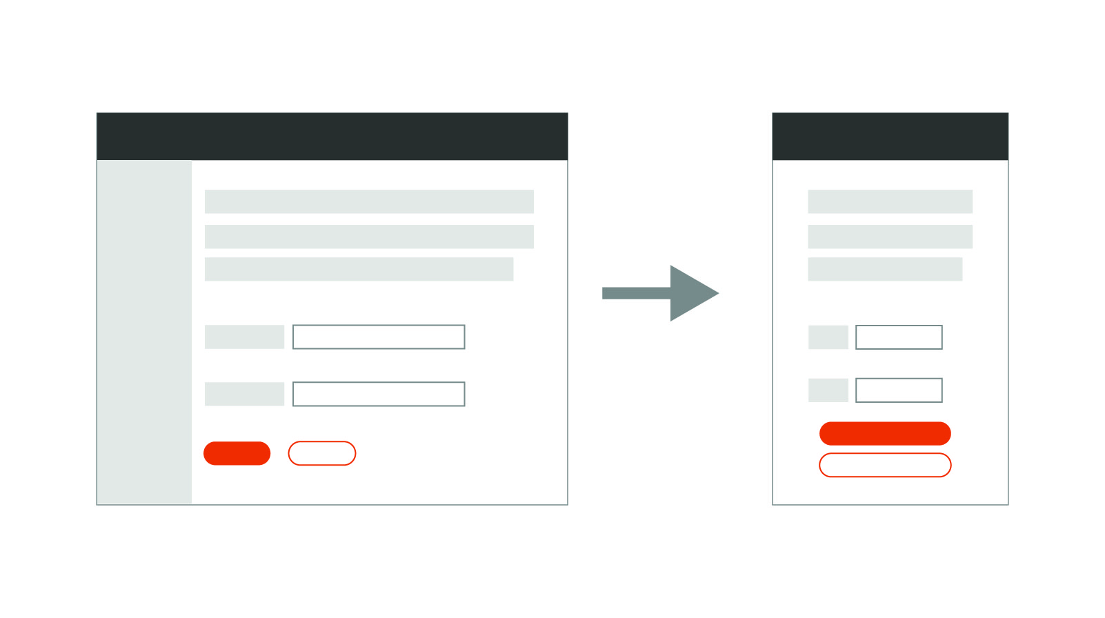
Keep It Simple
Lead generation is a fundamental component of most marketing and sales strategies, and form design plays a crucial role in identifying and attracting potential customers. It directly affects a visitor’s willingness to fill out the form and provide their contact information.
A well-designed lead generation form is user-friendly and easy to understand. If visitors find it confusing or cumbersome to fill out, they are more likely to give up out of frustration before completing it. An intuitive layout, clear labels, and logical flow will improve user experience and encourage form completion.
Your lead generation form should also be mobile-friendly. With users increasingly relying on phones and tablets to access websites, it’s essential to have forms that are responsive and display correctly on various screen sizes. Make sure users can easily fill out the form without any usability issues.
Other tips for designing lead generation forms that will produce results include keeping the form as short and simple as possible, making it visually appealing through eye-catching colors and compelling call-to-action buttons, incorporating trust signals such as privacy statements and security icons to ensure credibility and security, and ensuring your forms load quickly. Avoid using large images and complex scripts to ensure speedier load times.
The Right Button for the Right Action
There are several key types of form/input field buttons whose main purpose is to trigger an action based on the user’s input. These include:
- Submit Button. This is the most common type of form button. It's used to submit information a user has entered into the form. In a login form, for example, the submit button is clicked after the username and password have been entered; this triggers submission of the form for authentication.
- Reset Button. This button clears the entered data in the form so it reverts to its initial state. Reset buttons have become less common, as users can easily undo their inputs by manually deleting or modifying the data.
- Action Button. Some forms include buttons that trigger specific actions related to the form's purpose. For example, a "Save Draft" button in a content editing form allows users to save their work without submitting it.
- Search Button. In search forms, a search button is used to initiate a search query based on the entered keywords. It's used alongside a text input field where users type their search terms.
- Checkbox Button. A checkbox button allows the user to make two or more selections. It is often used to adhere to legal requirements, such as accepting terms and conditions or opting in for emails.
- Radio Button. The radio button is similar to the checkbox button but only allows one choice instead of multiple selections. Choosing an ethnicity on a job application or answering yes/no questions are instances in which radio buttons are used.
Thoughtful Button Design
Form/input field button design requires careful consideration in terms of their placement, visual design, and labeling. They should be easily noticeable, readable, and logically placed near the input fields they correspond to. Button labels should be clear and descriptive, indicating the action that will be performed when the button is clicked.
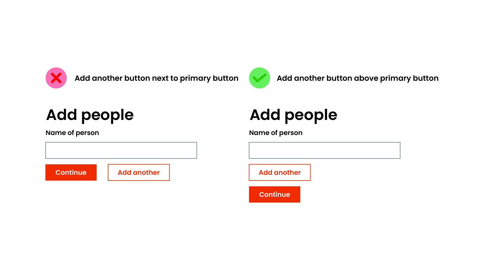
Additionally, UX designers often focus on making these buttons visually distinct through color, size, shape, and placement. For example, the primary action button, such as "Submit," might be more prominent than a secondary button like "Cancel" or "Reset."
Because they are a part of the overall visual branding of a product or application, the button design should align with the brand's aesthetics to create a cohesive and recognizable look and feel.
Ultimately, the design of form/input field buttons contributes to the overall user experience by guiding users through the process of providing input and interacting with a digital interface effectively and intuitively. Incorporating UX button best practices ensures a consistent and smooth user experience.
UX Button Best Practices
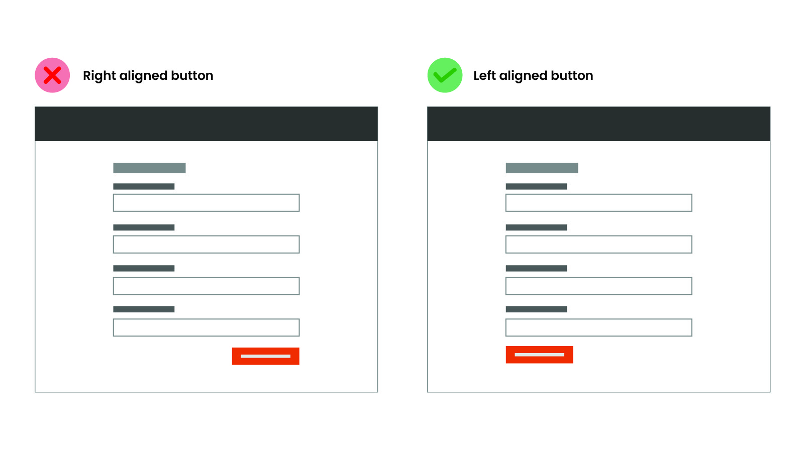
If the form is full-page and there are no additional actions, the primary action should be aligned to the left-hand edge of the form.
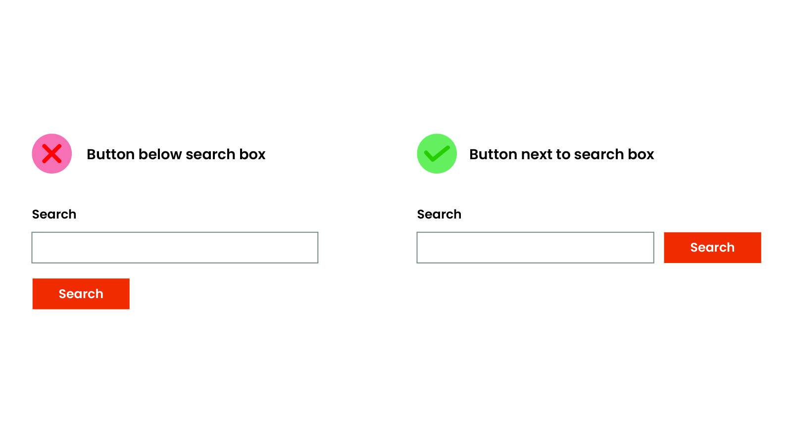
If the form is a singular item, like an email, the primary action should align with the input field.
If the form is short, in a modal, or mixed in with other content, the primary action should be aligned to the right. Centered may also work in some cases.
If secondary actions are associated with the form, the primary action should be aligned to the left, though this is easily disputed based on what you are after. Primary action should have a distinguished look to capture attention.
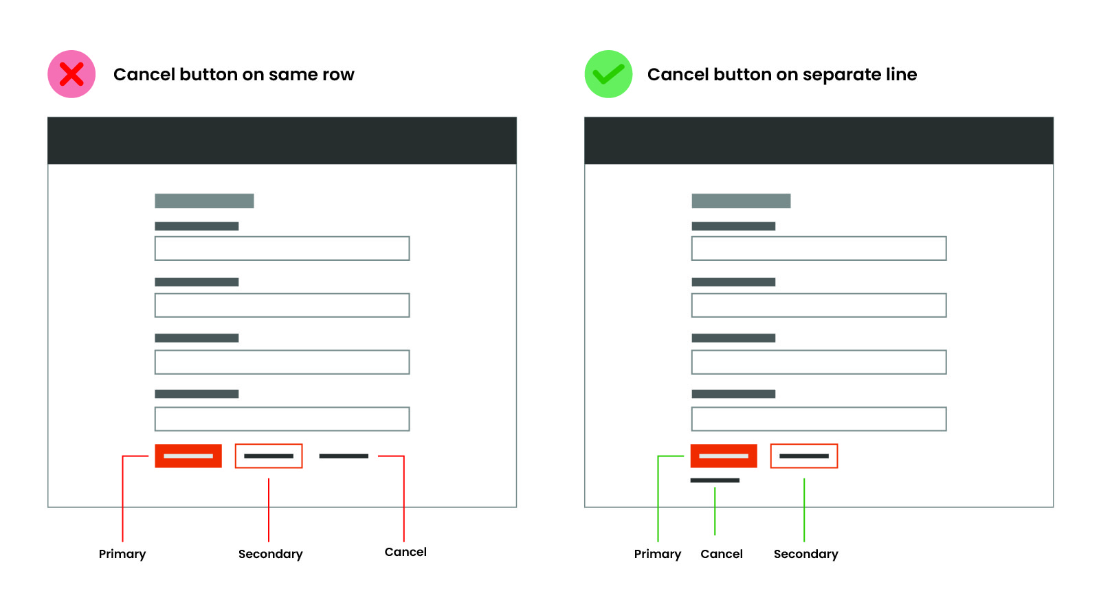
If there are two primary actions, each action should be on its own line aligned to the left.
In most cases, mobile buttons should be centered under the form and stack accordingly.
Like most things in the design world, much of this is up for debate and quite subjective based on who you read or ask. But I find most of these patterns tend to be more pleasing to the eye and balance well with some studies and reasoning to back them up.