How a well-designed homepage guides visitors instead of overwhelming them
A homepage is not a storage space for everything a company wants to say. It is a guide that helps visitors understand where they are, find what matters to them, and take the next sensible step.
We hear this request often during website design reviews: “Can we get all of this above the fold?”
It sounds like a practical goal. Important information should be easy to find, and no one wants the main message buried halfway down a page. The problem begins when “easy to find” becomes “everything must appear before anyone scrolls.”
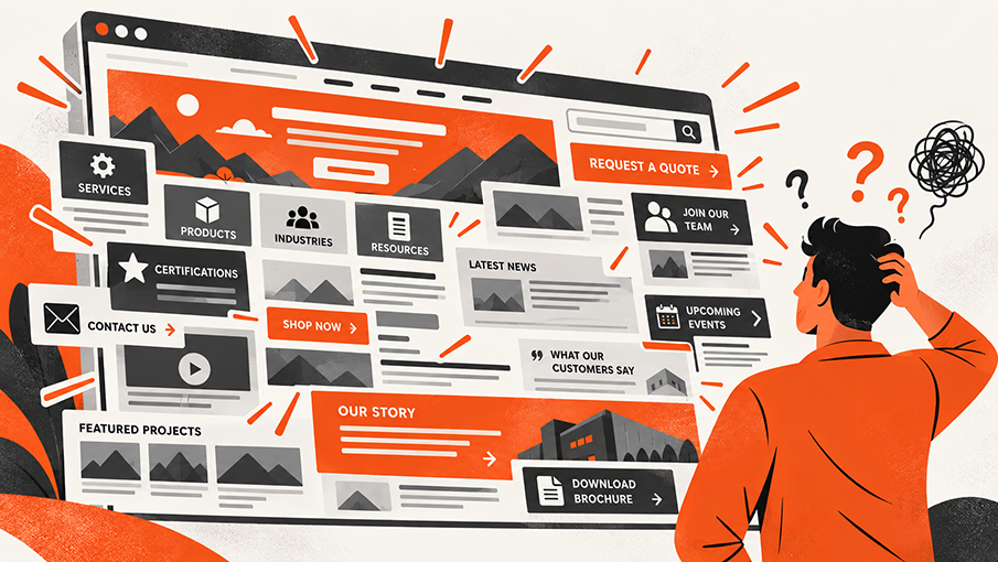
That is when the top of the homepage starts carrying too much weight. Headlines compete. Buttons multiply. Supporting copy gets squeezed into smaller spaces. It all may technically fit on a screen, but it becomes harder to understand.
The concern behind the request is valid: visitors should not have to work to understand a website. Our job as designers is to solve that concern with hierarchy and page flow, not compression.
What “Above the Fold” Actually Means
The phrase comes from newspapers. The most important headline and image appeared on the upper half of the front page so they could be seen while the paper was folded on a newsstand.
In website design, "the fold" became shorthand for the part of a page visible before someone scrolls.
The difference is that a newspaper has a fixed size. A website does not. The visible area changes with every phone, tablet, laptop, desktop monitor, browser window, and screen orientation. A section that appears in full on one screen may be partially visible on another. There is no single line we can use as the universal fold.
That does not mean the top of the page is unimportant. It means we need to be more precise about its purpose.
The opening view should quickly answer three questions:
- Where am I?
- What does this company do?
- Where can I go next?
When Everything Has to Be First, Nothing Feels First
The top of a homepage often becomes crowded for understandable reasons. Every service matters. Every product line deserves attention. A certification feels important. A recent announcement needs visibility. Sales wants a quote button. Human resources wants a careers link. Leadership wants the company story represented.
When all of those requests are treated as equal priorities, the design loses its point of view. Visitors see many things, but they do not know which one matters first.
This is not a space problem, but a prioritization problem.
Good hierarchy makes a choice. It creates one clear starting point, supports it with the right amount of context, and makes the next step visible. The rest of the homepage can then continue the conversation in an intentional order.
People Will Scroll When the Page Gives Them a Reason
Scrolling is a normal part of using the web, especially on mobile devices. Visitors do not need every answer in the first screen. They need confidence that the page contains something useful and that continuing will be worth their time.
Design can make that continuation feel natural. A headline introduces the main idea. Supporting copy provides context. An image helps visitors understand the business. The beginning of the next section can remain visible near the bottom of the screen, signaling that the page continues.
Clear section changes, descriptive headings, and a consistent visual rhythm also help people move through the content without feeling lost.
You don’t want to force people to scroll, but rather remove the visual signals that make them think the page has ended or that nothing useful follows.
The Homepage Should Guide the Conversation
A strong homepage works less like a bulletin board and more like a helpful introduction to the business. It gives visitors information in the order they are likely to need it.
At Foremost, we often think about that journey in five stages.
1. Orientation
Help visitors understand whose website they are on, what the company provides, and whether it is relevant to their needs.
2. Direction
Present the primary paths visitors can take. Those paths may be based on products, capabilities, industries, applications, or audience needs.
3. Understanding
Explain the most important capabilities and differences without trying to reproduce every interior page on the homepage.
4. Confidence
Support the message with useful proof such as project examples, certifications, customer stories, original photography, experience, or technical resources.
5. Action
Offer a sensible next step once visitors have enough context to take it. That might mean exploring a capability, viewing products, requesting a quote, or contacting the team.
Not every homepage needs to follow this exact formula. The order depends on the company, the audience, and what visitors need to accomplish. The important part is that the order is deliberate.
Each section should answer a question and prepare the visitor for what follows.
Guidance Is Visual as Well as Verbal
Page guidance is not created by copy alone. Size, spacing, contrast, imagery, alignment, and placement all tell visitors what deserves attention.
A large headline establishes the main idea. Supporting text adds detail. A contrasting button identifies an available action. Generous spacing separates one thought from the next. Repeated layout patterns make the page easier to scan.
This is why simply moving more content above the fold rarely solves the underlying concern. If the hierarchy is weak, moving an element higher only adds another competitor.
We first decide what role the information plays. Then we give it the appropriate position and visual weight.
The Fold Changes. The Story Should Not.
Responsive design is more than shrinking a desktop layout to fit a phone. The available space changes, content stacks into a new order, navigation behaves differently, and images may need a different crop.
The exact fold moves, but the intended story should remain clear.
On a wide monitor, visitors may see a headline, image, supporting copy, and button together. On a phone, those elements may appear one after another. We decide which information must remain visible first and how the sequence should adapt so the experience still makes sense.
Designing around one ideal screen size would ignore how real people use the site.
What We Decide Before Visual Design Begins
At Foremost, homepage guidance begins before we select colors, image treatments, or type styles.
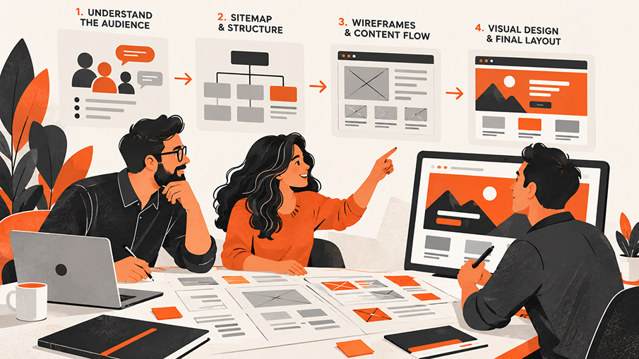
We start by understanding who needs to use the website and what each audience is trying to accomplish. We look at the questions customers ask, the information they need before reaching out, and the places where the current site creates confusion.
That thinking shapes the sitemap and wireframes.
For projects that call for a more customized design approach, this discovery and planning goes deeper. Our custom design process gives us more time to explore audience paths, content priorities, page structure, and the overall user experience before visual design begins. It’s a good fit for websites with more complex audiences, products, services, or business goals.
The sitemap determines where information lives and how pages connect. Wireframes establish the order and purpose of the homepage sections without letting visual styling distract from the structure.
By the time we move into visual design, the page already has a clear job and a reason for each element to be there.
Visual design then strengthens that plan. We use hierarchy, typography, imagery, spacing, color, and interaction to make the intended path easier to recognize and more natural to follow.
A Quick Homepage Check
Look at your homepage on both a desktop and a phone, then ask:
- Can someone understand what our company does within a few seconds?
- Is there one clear place for the eye to begin?
- Does the page show visitors where they can go based on what they need?
- Do the sections build on one another, or are they competing for attention?
- Are we using proof to support our claims?
- Does the design make it clear that more useful content follows?
- Are calls to action appearing when visitors have enough context to use them?
- Does the intended order still make sense on a smaller screen?
If those answers are difficult, the solution may not be adding more to the first screen. The homepage may need a clearer message, stronger hierarchy, or a better path through the information.
The Top of the Page Is the Beginning, Not the Whole Experience
The space above the fold matters because it creates the first impression. It should be clear, relevant, and intentional. But it cannot carry the full responsibility of the homepage.
Its job is to begin the experience and give visitors a reason to continue.
A well-designed homepage does not tell people everything at once. It helps them understand enough to make the next decision. Then it guides them from introduction to options, from explanation to proof, and from interest to action.
If visitors have to hunt for what matters, your site may need more than another section added to the top. The Foremost Media Creative Department can help simplify the experience, strengthen the hierarchy, and create a clearer path from first impression to next step.
Contact Us Today