In the world of web design, aesthetics play a crucial role in capturing the attention of visitors, conveying brand identity, and even influencing behavior. Standing out from a crowded field of competitors is key, and color is one of the best ways to achieve this.
The strategic use of color in web design involves more than just making a site look good; used properly, it can evoke certain emotions, convey messages, and enhance the overall user experience.
Current Website Color Design Trends
Website designers are embracing certain color palettes to achieve different results. Some are trendy, while others have withstood the test of time.
Dark Mode and Neutrals
Dark mode interfaces are more than just a trend; they also reduce eye strain and improve the battery life of electronic devices. Neutral colors like charcoal, deep grays, and muted tones complement dark modes beautifully, providing a calming and sophisticated experience.
Bold and Vibrant Hues
Bold and vibrant website color schemes are a proven way to capture users' attention and create memorable experiences. Bright oranges, electric blues, and intense yellows are being used to create high-energy visuals that leave a lasting impression. When using bold hues, it's important to strike a balance to ensure that the design remains visually appealing and user-friendly.
Nature-Inspired Tones
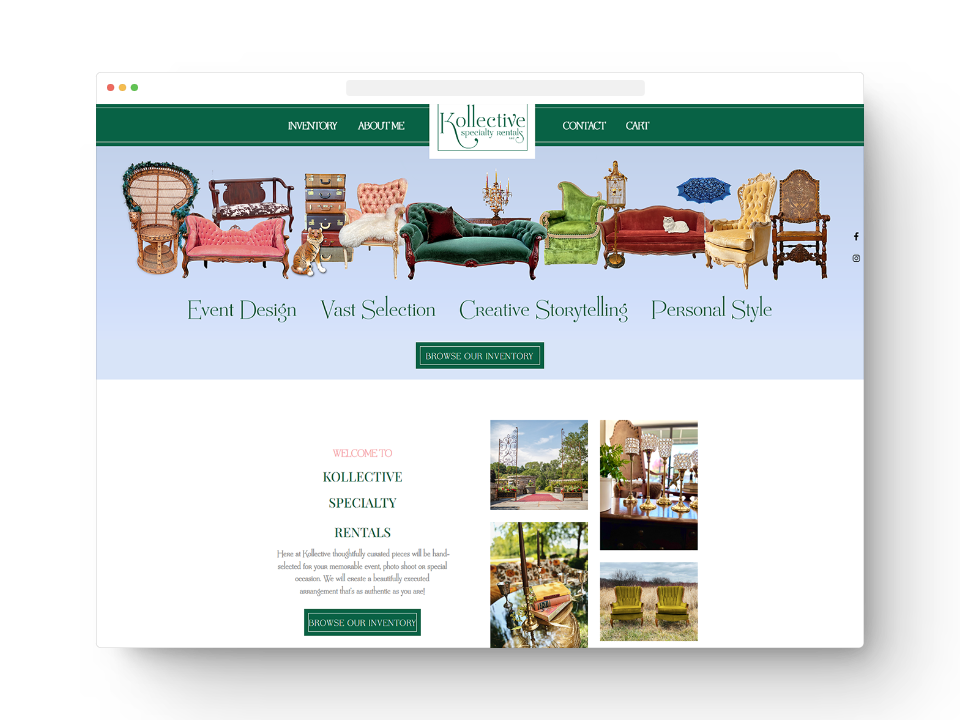
Earthy and organic color palettes draw inspiration from the natural world. They bring a whole new meaning to the phrase “going green.” Shades of forest green, deep brown, and muted earth tones are being used to establish a strong connection with nature and promote a sense of authenticity. Nature-inspired colors create a harmonious and soothing user experience.

Futuristic Neons
Neon has always looked cutting-edge and futuristic and is great at capturing attention. Today, neon colors make a bold statement in website color design. Electric pinks, vibrant greens, and intense purples are being used to convey innovation and forward-thinking. It's important to use them strategically to enhance the overall design without overwhelming users.
Monochromatic Elegance
Monochromatic website color schemes, in which a single color is used as the basis for all other shades and hues, prove that simplicity can be incredibly powerful. Monochromatic designs evoke a sense of elegance and focus, while allowing for subtle variations in tone to add depth and visual interest.
Color = CTAs, Conversions, Credibility, & Consistency
In many ways, the use of color on your website is an art form. Paying attention to the following elements can help drive traffic to your site and influence users to choose your brand over your competitors.
Call-to-Action Buttons
The color of your call-to-action (CTA) buttons can significantly impact click-through rates and conversions. Research shows that contrasting colors — those that stand out from the rest of the design — tend to attract more attention. Using a color that contrasts with your website's background can draw the user's eye to the CTA, making it more likely that they'll click and convert.
Building Trust and Credibility
Certain colors are associated with trustworthiness and professionalism. Blue, for instance, is often seen as a color that symbolizes reliability and credibility. Incorporating such colors into your branding and website can help establish a sense of trust with your audience.
Color Consistency and Brand Identity
Consistency is key when it comes to color. Building a strong and recognizable brand identity requires using consistent colors across all touchpoints. This consistency not only helps with brand recognition but also fosters a sense of reliability and familiarity, both of which can positively impact conversion rates.
How Color Influences Emotions
Color psychology is a well-established field that examines how different colors can evoke specific emotions and feelings. In web design, understanding these emotional responses will help you create a great user experience. Here are some examples of how colors influence emotions:
- Red: Red is associated with passion, energy, and urgency. It can be used to draw attention to important elements like calls to action or notifications. Companies like Coca-Cola, Target, and Netflix harness the power of red.
- Blue: Blue signifies trust, calmness, and reliability. It's often used by brands that want to establish credibility and professionalism. Think Facebook, American Express, and Ford.
- Green: Green is linked to nature, growth, and health. It can work well for websites that focus on environmental issues or wellness. Whole Foods, John Deere, and Starbucks all embrace green.
- Yellow: Yellow exudes positivity, optimism, and warmth. However, its high visibility can also make it overwhelming unless used sparingly. McDonald’s, Nikon, and Best Buy feature yellow prominently.
- Purple: Purple represents luxury, creativity, and sophistication. It can add a touch of elegance to your design. It’s used by brands like Hallmark, Cadbury, and FedEx.
- Orange: Orange combines the energy of red with the friendliness of yellow. It's often used to create a sense of enthusiasm and excitement. Home Depot, Dunkin’, Harley-Davidson, and Foremost Media rely on orange.

Navigation and User Experience
Color plays a pivotal role in enhancing the user experience by aiding navigation and information hierarchy. Designers can use color to create visual cues that guide users through a website. Areas in which this can be applied include:
- Navigation menus: Highlighting the active or hover state of menu items with color changes helps users understand where they are on a website.
- Buttons: Contrasting button colors make them stand out, encouraging users to click on them, especially when they represent important actions like "Subscribe" or "Buy Now."
- Error messages: Using red for error messages alerts users to issues that need their attention, improving usability.
- Categorization: Grouping related content or products with distinct colors makes it easier for users to identify and navigate through different sections of a website.
Website color scheme is also instrumental in ensuring accessibility and inclusivity. High-contrast color combinations ensure all users, including those with visual impairments, can navigate through your site easily. Choose a dark color for your text and a light color for your background (or vice-versa). Also avoid color combinations that can be difficult to read; approximately 5% of the population experiences colorblindness and can’t distinguish between red and green. Blue and yellow, and red and black, are other combinations to steer clear from.
Website color schemes are a powerful tool that, when used strategically, can create captivating and communicative online experiences that significantly influence user behavior and engagement. If you would like to learn more about implementing various color schemes into your Custom Website Design, UX Analysis, reach out to the Foremost Media design team today!