Choose Readable Fonts:
Do: Opt for clean and legible fonts like Arial, Helvetica, or Roboto for body text. For headings and accents, you can be more creative, but ensure they remain readable.
Maintain a Hierarchy:
Do: Establish a clear typographic hierarchy with different font sizes and styles (bold, italics) for headings, subheadings, and body text. This guides users through your content.
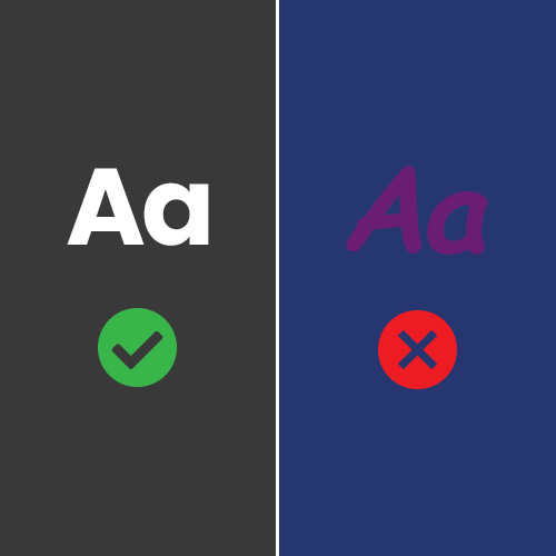
ADA Compliance:
Do: Prioritize color contrast to make your content accessible to all users, including those with visual impairments. Ensure that text and background colors have a sufficient contrast ratio of at least 4.5:1 for standard text and 3:1 for large text. There are various online tools available to help you check and improve color contrast.
Responsive Typography:
Do: Use responsive typography that adapts to various screen sizes and resolutions. Consider using relative units like ems or percentages instead of fixed pixel sizes.
Consistency is Key:
Do: Stick to a consistent set of fonts and styles across your website. This creates a cohesive and professional appearance.
Overload with Fonts:
Don't: Resist the temptation to use too many fonts. Limit yourself to two or three typefaces for a cleaner look.
Tiny Font Sizes:
Don't: Avoid tiny font sizes. Ensure that text is easily readable on all devices without users having to zoom in.
Ignoring Readability on All Devices:
Don't: Forget to test your typography on different devices, including mobile phones and tablets. What looks good on a desktop may not work well on smaller screens.

Using Too Many Text Effects:
Don't: Excessive use of text effects like shadow, gradients, or animated fonts can distract users and make your website look unprofessional.
Inconsistent Styling:
Don't: Inconsistency in font choices, sizes, and colors across your website can confuse users and make your design appear chaotic.